Custom Color Picker
A reusable color picker designed to work across frameworks and environments.
A reusable color picker designed to work across frameworks and environments.
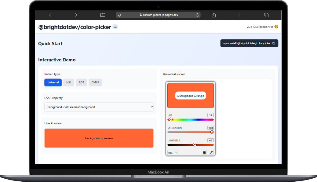
Second version of the picker showcasing refined UI and accessibility improvements.
The initial prototype of the color picker, simple but functional, before accessibility work.
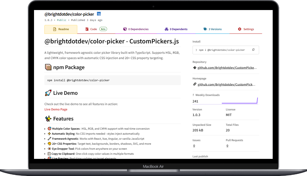
The package as it appears on the official NPM registry with usage instructions.
Challenge: Most color picker libraries were tied to specific frameworks or lacked accessibility support. Approach: Built a framework-independent solution using HTML, CSS, and TypeScript with keyboard navigation and ARIA support baked in. Outcome: Created a lightweight, reusable component that developers can integrate across multiple frameworks with minimal setup.
Smooth color selection using the latest polished version.
Early build of the color picker, functional but without accessibility features.
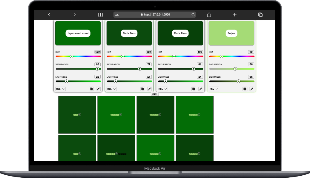
Final polished demo highlighting usability across frameworks.
Lightweight color picker with keyboard accessibility and framework independence. Published as an NPM package for easy integration.